The Marks of the Estate.
Five marks, used with restraint. The crest is the formal signature; the cipher and the brand mark its quieter voices. Each has a place — and a use case kept narrow on purpose.
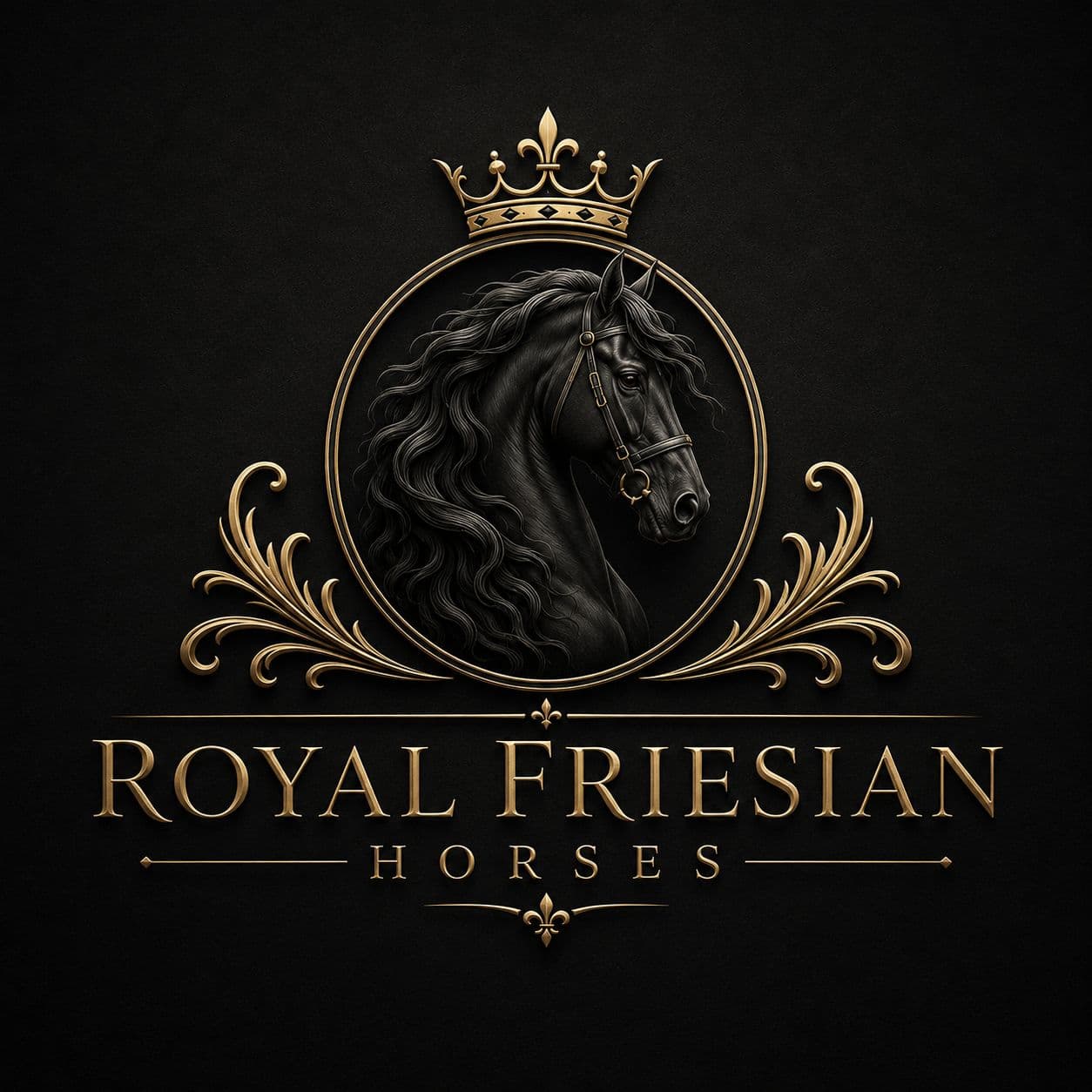
Pl. 01 — The Formal Signature
01 · Crest
The full house mark.
Application
Stationery, sales contracts, the home page hero, press releases, and the gates of the estate. Never reproduced at less than 200 pixels.
Construction
Crown · gold-rimmed roundel · Friesian head with bridled mane · acanthus scrollwork · serif wordmark with fleur-de-lis tag.
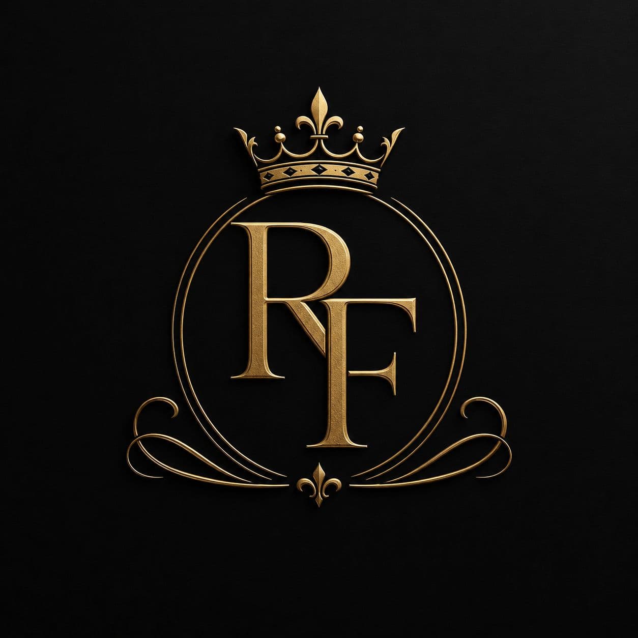
— 02 · Monogram
The cipher,
crowned.
Used where the crest would be heavy-handed: foal certificates, the saddle pad, the inside flap of the brochure, the corner of an envelope. The crown and scrollwork are retained; the portrait is not.
- Pairs with a hairline gold rule
- Always reproduced in antique gold
- Minimum size: 56 px on screen
- Never used as a watermark behind type
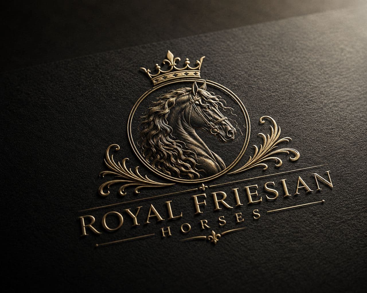
— 03 · Gold Emboss
Pressed in,
not printed on.
The most sculptural application of the brand — the iconic mark struck in 24-karat gold, modelled in soft relief. Reserved for the sales certificate, the foal birth letter, and the bound stable book.
- Foil
- 24k gold leaf
- Stock
- Crane 280 gsm
- Depth
- 0.4 mm
- Finish
- Soft satin

— 04 · Light Surface
On warm ivory.
The shield variant — for catalogs, certificates, photographic plates, and the back of every business card. The portrait remains in deep ink; the ornament holds in antique gold.
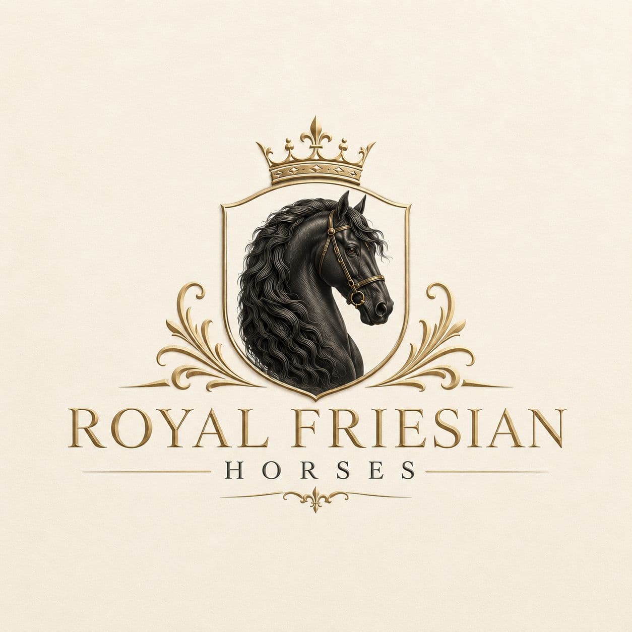
Pairs With
Crane Lettra 110 lb · Mohawk Superfine Eggshell · undyed linen · raw bridle leather.
Avoid
Pure-white digital backgrounds, glossy coated stocks, and photographic backdrops with figures behind the mark.
Clear Space
Equal to the wordmark x-height on every side. Never less.
— 05 · Brand Mark
The smallest signature.
The mark answers to surfaces the crest cannot — the wax seal, the stall plate, the corner of every photograph credited to the estate.
Pl. 05 — Brand Mark · For all small-format applications
— Appendix
The estate palette.
Six colours, used in this hierarchy and in these ratios. The gold is never the loudest thing on the page.
- #111315
Deep Warm Charcoal
Primary background
- #1A1D21
Soft Graphite
Lifted surface · cards
- #0E1714
Forest Black
Cinematic bands · footer
- #F5F1E8
Warm Ivory
Primary text · light surface
- #A8A29A
Warm Stone Gray
Secondary text
- #B79C6A
Muted Antique Gold
Accent · sparingly
— Typography
Fraunces & Inter.
Fraunces — the serif of the estate, used for the wordmark and every display headline. Inter — the workhorse, set in tracked-out uppercase for eyebrows and in regular for body.
Aa Bb Rr
Fraunces · Display
AA BB RR · Royal Friesian Horses
Inter · Body
— End of Volume I
“A house mark is a promise made in shorthand. Ours is to ride into the next century as we did the last — quietly, and well.”